Many Roland DGA customers are business startups, trying to get a foothold in business. Making great custom graphics and products is one thing, but the business of sales and promotion is another, and it may not be where your skills lie. When investing in expensive outside vendors and agencies is not an option, there are rules-of-thumb that can help you design your own ad for a bus stop, a local magazine, a company brochure, or other advertisement to help you get the message out.
Message and design commonalities can be taken apart and examined so that you can create successful marketing and promotional collateral. This guide can help you dissect your promotions and examine the tried-and-tested factors that go into effective content.

1. Headline
Your headline is critical to your promotion and gives it purpose and meaning. Put into context, it can be as simple as the word “sale” on an email or your product name on a brochure— it doesn’t have to be complicated. However, why make a generic headline that won’t help you stand out?
Think “effective” not “clever”
While a headline can be full of humor, seduction, passion, etc., don’t try to force drama into your headline. Firstly, your headline must relate to your product and business message and then you can build emotion around those strategies. There’s an awful habit that even established companies fall into in trying to lever in puns and popular phrases into promos— an old-fashioned perception that can leave the reader utterly perplexed?
While using clever or witty phrasing to get your point across is effective at grabbing attention, it mustn’t be your motivation for writing a headline.
The motivation for your headline
What is the motivation for your headline? Whether it’s as obvious as a sales promotion indicating that you a product discount, an advertisement for a new product, or you’re simply advertising your services, there has to be an objective or you’re wasting promotional real estate. A headline should tell the viewer what you’re solving, why you do it better, that you have the lowest prices, have the best quality product, etc., you need something that makes you more attractive than other businesses and sets you apart.
Headline examples
Here are just a few examples of actual headlines with messaging strategies you can adopt for your own business.
Feelgood: “Good mornings follow a good Nytol.” (Nytol Cough Medication)
Impel the Viewer: “Don’t dream of winning, train for it.” (Nike)
Intriguing: “How does the man who drives the snowplow drive to the snowplow?” (Volvo)
Inspirational: “Impossible is nothing” (Adidas)
Humorous: “They don’t write songs about Volvos.” (Cadillac)

2. Copywriting
Rule one of writing copy for your ads and promotions is to understand the voice of your business. Now you may assume that you already know who you are and who your customers are, but this does not always translate in writing for some people. It’s a skill that professional writers develop— recognizing what kind of business you are and what products you sell and adapting the copy to fit an appropriate voice.
But you can do this yourself by simply “being yourself”. Whether you’re writing a paragraph for an ad or an entire brochure, the body copy should reflect the way you talk to your customers daily with intelligence and consideration. Write only from your business perspective and avoid the following common pitfalls:
Wisecracking
It’s doubtful whether you've ever immediately start joking around with a customer you just met in real life, so don't do it in your written communications. Having a great sense of humor is always advantageous but writing witty copy in a marketing scenario is a real skill and humor can sometimes be seen as you not taking your business seriously enough or it can just taken the wrong way— it's better to avoid it.
The English gent
It’s counterproductive to write like you’re writing a thesis to impress your professor. Be concise and smart sounding but avoid being “wordy” and using verbiage that you wouldn’t use in normal conversation.
Meandering
Always get to the point as quickly as possible and speak clearly about your promotions— about the benefits, quality, distinctions, and advantages of your products.
Jargon
It’s okay to use words like “superior service” and “quality products” but don’t overuse this type of marketing speech— try to be as natural sounding as possible.
Seven ways to plan and write your copy
The following points outline the things you need to do to plan your copy and make it perform to your advantage:
1. Clear thinking:
Have a target and intent with your copy and be direct and succinct—clearly address the benefits of a promotion, a sale, a new product, or what you can offer as a business in quick, positive language.
2. Speak confidently
Don’t be passive in your language, you must always speak with confidence. Avoid statements like “we try to provide the best service” when you can say “we provide the best service.”
3. Storytelling
Your copy should always tell a story. Break it down into the following:
• A short introduction about your business or offer
• The setup— details about your promo, service, or business intent— not just on the surface, but the positive results and gains that your product or service provides
• The payoff— conclude with what you’re offering and provide a conclusion/takeaway from your story (see CTA at the end of this section)
4. Action copy
Describe the benefits customers get from your business as soon as possible. The benefit is everything to a customer: Is it cheaper? Is it faster? Is it the most modern and effective? Will I enjoy this experience? Will it make my life better? Will it make me money?
5. Subheadings
Don’t write in long paragraphs. Make your paragraphs nice and short and use writing devices such as subheadings to make your copy very instantaneous and immediate. It helps organize your copy into an easy-to-follow story— subheadings offer a great summary of your promo, offer or business story without the need to read each paragraph.
6. Bullets and infographics
Summarized lists of features and highlights are a way to draw attention to major benefits while giving the viewer information in more manageable boxes of information. It can also be beneficial to put a complex piece of info in a simple data graph or graphic. A picture can often say more in a single glance than an entire paragraph of text can.
7. The all-important call-to-action (CTA)
Never forget to add a purpose to your copy. For your copy to be effective, you ultimately need people to notice your phone number, link to your web address, promo link, or online store. This is far more important than getting them to read any anything that comes before or after, so you need to direct your story towards this conclusion. To make it satisfying, your call-to-action must be easily seen and impel the reader to take action. The following CTAs are just a few examples of commonly used CTA verbiage that stands out on the page:
Go to our website, NOW!
Read more at
Join the party at
Time is running out! SAVE NOW at
You can make a difference at
Discover the secret here
See how we did it
Sign up for FREE right now at
Call now to speak to a success expert
Find your own style at
Call us now at

3. A quick design guide
A lot of Roland DG machine users are great designers, but there’s more to design than just imagery when it comes to business promotion. The design of your promotion needs to make sense of the information you’re presenting. Understanding the relationship between words and images is key to great business design.
Before you even start designing something consider the following:
- Be intentional with your design— don’t add imagery just because you like it! Every image you use in an ad, promo, or webpage needs to relate to a headline or a piece of information
- Composition is vital— before you design anything, have a visual plan of where your copy will sit and where the related images will complement your copy
- Use copy and imagery together— don’t be afraid to add captions underneath images, color block sections of copy with imagery to highlight something, and generally treat copy as another aspect of your design
- Make every block of text readable—as a rule, each section of body copy should be at least 10-point font weight and captions at no less than 7-points
- Great design is always harmonious design— iIt’s where copy and images work together to communicate a message

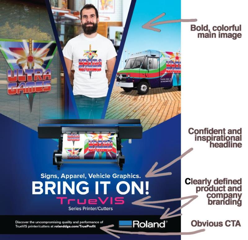
Overview of company promotion that shows how each messaging component is offered as clear, concise info to the viewer, with each element working together to deliver a confident, persuasive, actionable message about a product.
Rule of threes
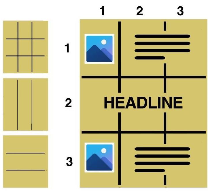
The rule of three is a great guide to consider for every web, brochure ad and promotional design you produce. It’s a guide to how people naturally breakdown visual information — naturally following the way a viewer sees and takes-in graphics and text. By splitting your page into three vertical or horizontal sections, you can create a layout that reflects the eye-flow of people viewing your design.

Various rule-of-three layouts, including a version with placement of headline, copy, and images in the three block grid pattern.
- If you’re starting a graphics business with a Roland DG desktop device, you already have a head start on most new business startups with the design ability to create your own artwork for ads, promotions, social posts, etc. And although every promotion is different, these tips on writing clear copy and designing a powerful and strong visual message are good rules-of-thumb when it comes to creating your own content.


