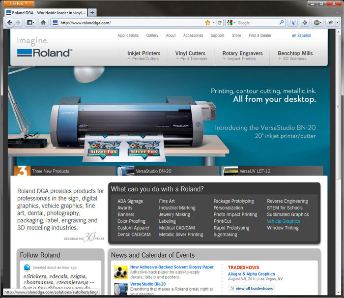
We recently updated the home page of our web site at Roland DGA. It sounds simple enough to do, but the reality was quite different.

First of all, web sites have evolved enormously over the past several years. In the early days of the Internet, just having a web site was a source of pride for many businesses. Many of these early sites were nothing but an electronic letterhead or brochure. Even today, you can find some sites that are little more than a business name and contact info.
As time went on, the emphasis shifted to content. Web designers added navigation bars with drop-down menus that offered quick access to information on the company, its products and where to find them. Meanwhile, usability studies began to lay the ground rules for what made a site eye-catching and easy to navigate. Many years ago, I remember coaching our team to treat our home page similar to a magazine cover by using dramatic graphics and a handful of story leads to capture attention and draw the visitor in. We even experimented with adding music and sound effects to very mixed results.
To increase stickiness, we developed an online gallery where you could browse the work of other Roland DG users. User forums gave owners the opportunity to share with and learn from their peers. E-commerce appeared shortly thereafter, adding yet another objective. And another complication. Now, just enticing the visitor to explore and learn wasn't enough. So, we added an online store. Offering online customer support became vitally important as well.
As Google and other search engines grew in importance, Search Engine Optimization (SEO) became critical. Just designing an attractive, hard-working site was no longer good enough. It also needed to score well in page rankings.
More recently, social media became a phenomenon. As we rolled out Twitter, Flickr, Facebook pages (2) and a blog, we wanted customers and prospects to know we were listening — and responding.
All of that contributed to the latest redesign of our home page. But there was much, much more. After all, not everyone who visits our site knows what product they're looking for. So we've spent the past few years building solutions pages where visitors can explore how to make the hundreds of products produced on Roland DG devices. We even added Roland DGA TV for watching videos and a Tips & Tricks section to show how easy it is to use our products. And it was good. In fact, over a million unique individuals visited our site in the past year.
But try telling that to a perfection-seeking web design team. It's not an easy task these days building a web site. Once you're done, it's time to start over.
To see the fruits of our latest efforts, click here.
And if you have any feedback or suggestions for improvement, our web team would love to hear it.

